| Home | Job | Pinball | Photo Album | Automotive | Press/Awards | Contact |

How
it got
started
In February 2007, Karl
Ruehs (RGP
handle is 'Karlzona')
put
a
restored Space
Shuttle
playfield
on ebay. Prior to that, we had been
corresponding about various restoration ideas, but the auction's photos
were the first time I saw the result. They looked so good, I
decided to ask him for a scan of the playfield. This is
something
I wished I had done when I restored my Space
Shuttle
Playfield, but I did not have the HP4600 scanner at the
time.
To support this project, Karl purchased an HP4600, which is the same
scanner I used for the translite
project. After some initial driver and installation
issues,
we got up and running, and he was scanning the playfield.

A picture from Karl's playfield auction on Ebay. It turned out really great.

This is my playfield, post-restoration. I think the artwork is really beautiful,
and worthy of saving.
More pictures of my playfield post-restoration.
A picture from Karl's playfield auction on Ebay. It turned out really great.
This is my playfield, post-restoration. I think the artwork is really beautiful,
and worthy of saving.
More pictures of my playfield post-restoration.
We
resolve to
get the best
resolution
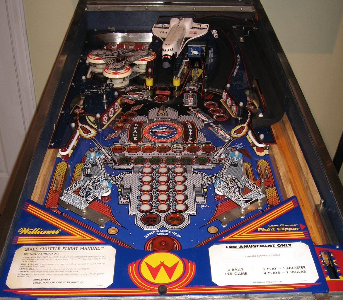
The artwork on the Space
Shuttle
playfield measures 18" from left to right, and 38" from top to
bottom. This is a total print area of 684 sq.
inches. This
exceeds the area of the translite project by just a little bit (599 sq.
inches), so I felt my computer could handle the artwork. We
decided to try to scan at various resolution and file formats to find
the optimal settings. The file types we considered were TIFF
(lossless compression, but big files), and JPG. I
standardized on
one particular location on the playfield to compare the various
images. The images below are raw scans and have not been
enhanced
in any way.

The first scan was at 200 dpi and saved as JPG. Note the pixelated grid lines.
Total playfield file size is about 12 MB.

Increasing the resolution to 300 dpi (JPG) causes a large increase in quality.
Note the better grid lines and the fine lines in the white bar at the top of the image.
Total playfield file size is about 62 MB.

Resolution increased to 600 dpi (JPG). Slightly visible improvement.
Total playfield file size is about 151 MB.

One more test at 300 dpi (TIFF).
Total playfield file size is about 256 MB.
The first scan was at 200 dpi and saved as JPG. Note the pixelated grid lines.
Total playfield file size is about 12 MB.
Increasing the resolution to 300 dpi (JPG) causes a large increase in quality.
Note the better grid lines and the fine lines in the white bar at the top of the image.
Total playfield file size is about 62 MB.
Resolution increased to 600 dpi (JPG). Slightly visible improvement.
Total playfield file size is about 151 MB.
One more test at 300 dpi (TIFF).
Total playfield file size is about 256 MB.
From the trials, we
could see that
200 dpi was not acceptable. Also, there appeared to be little
benefit to using TIFF format. I know that is a lossless
compression method, but the file size was just so big compared to any
benefit. We finally settled on scanning at 600 dpi, and
saving
the files in JPG format.

Thumbnail pictures of all the scans.
Thumbnail pictures of all the scans.
Photoshop
work
Now came the step of combining the scans and removing defects. Karl's playfield has an overlay over the middle star base medallion that is slightly different from the original. There was also a fair amount of fine alligator cracks in the finish as can be seen from the test scans above. These will be removed during this step of the project.
The scans arrived in ten files, and I started to combine two of them. The resolution was 600 dpi, and I quickly found this resolution to be impractical. The Photoshop file grew to 344 MB, and I had only combined two of the ten segments! Also, rasterising and saving the image took several minutes. To overcome this, I cut the image resolution down to 300 dpi. Merging two segments resulted in a Photoshop file size of 93 MB, a more manageable size.

The merged set of ten scans from Karl. Note that the center medallion is a decal, and is why it looks brighter.

Test Print 1 overlaid onto the junk playfield. This playfield
will be the first target of the overlay.


Example of the redrawing of the playfield in progress.

The redrawn playfield using the gradient dots as a back layer. This allows me to replace it later if needed.
Note that the blue is solid. The grainy texture is due to JPG compression in this excerpt.

The completed artwork. Every pixel you see here has been
redrawn.
Note that the holes in the playfield have wood texture. In the finished
overlay, they can be cut out, or left in place to cover the wood.

Test Print 3 turned out real beautiful. The colors were very vibrant and
matched quite closely. Only the blue background on the
lower playfield needed to be tweaked.
E-mail from a recipient of Print 3:

A major step forward is printing on vinyl. The parts in pink will be clear to allow the inserts below to show.

Print 4 on adhesive vinyl with clear and color parts.

Close-up of the center of Print 4. Compare with this view of my restored playfield.

Test Print V. The insert text is now separate.


Color sample with the blue Pantone colors and their RGB values printed
with the same printer on the same substrate. This is much more accurate
than the color wheels I was using in the corners of the artwork.
Note from a recipient of Print 7
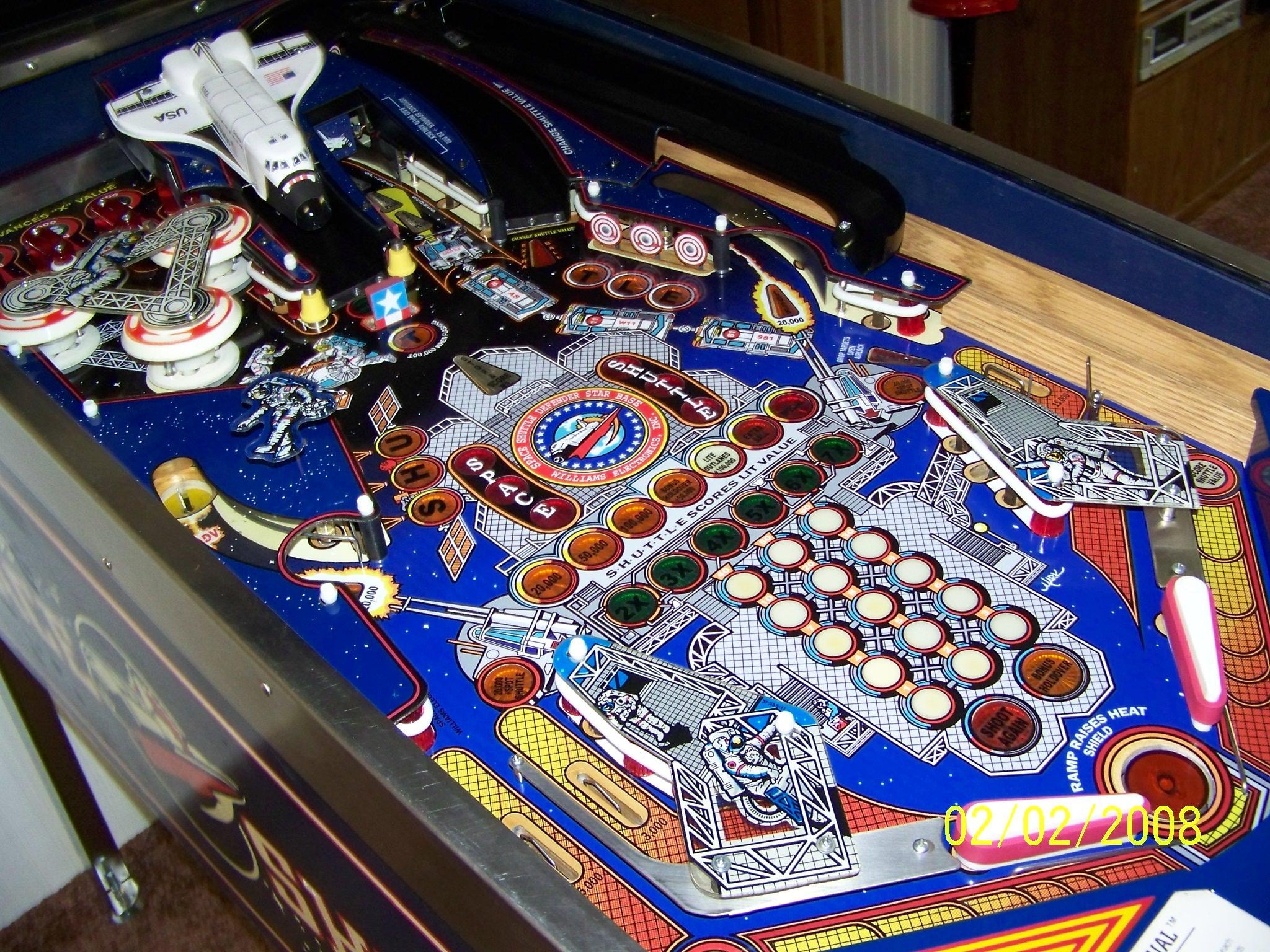
Overlay Installed
I no longer have a playfield to apply the overlay, but below are several users of the overlay that sent me their photographs.

Restoration #1 by Daniel C. The result is absolutely stunning. Click on the image for a full resolution photo.

It is very gratifying to see another machine beautifully restored (Restoration #1).
Restoration #2: Here are pictures from Ken C., another person that installed the overlay.


Restoration #2: Note that Ken did a better job with the insert text.
This playfield looks really beautiful.

Restoration #3 courtesy of Andrew. Note the similarity with #1, except Andrew
repainted his bullseye targets for a very complete restoration. Click
the image above for an overall view.
Restoration #4 from Dana in Canada. Click image for full size.

#5 from Joe. He will be repainting the Shuttle and targets next.
It looks great already.

Unit #6 from Greg B.

Another photo from Greg (time lapse).

Overlay #7 from Brian B. He writes:

Overlay from Chris G.

To compare the size of your playfield with my reference unit:
Page 2 of Playfield Page
Now came the step of combining the scans and removing defects. Karl's playfield has an overlay over the middle star base medallion that is slightly different from the original. There was also a fair amount of fine alligator cracks in the finish as can be seen from the test scans above. These will be removed during this step of the project.
The scans arrived in ten files, and I started to combine two of them. The resolution was 600 dpi, and I quickly found this resolution to be impractical. The Photoshop file grew to 344 MB, and I had only combined two of the ten segments! Also, rasterising and saving the image took several minutes. To overcome this, I cut the image resolution down to 300 dpi. Merging two segments resulted in a Photoshop file size of 93 MB, a more manageable size.
The merged set of ten scans from Karl. Note that the center medallion is a decal, and is why it looks brighter.
The combined file with
all ten scans
in separate layers was a size of ~450MB. I then used a 36 inch wide
inkjet to print a full scale test print (Test Print 1). This
test
print was a
special version that was converted to monochrome and then run through
Photoshop's edge detection algorithm. This allowed the
features
and lines to stand out. I then backlit the playfield to check
how
the inserts shine through the test print. This is an
important
test to check the location of the inserts on the merged file.
It
took a few iterations and tweaks, but I was able to line up everything
very precisely. Once the file was flattened to a single
layer, it
had a size of 180MB.
Test Print 1 overlaid onto the junk playfield. This playfield
will be the first target of the overlay.
I started touching up
the defects,
and quickly realized that the only good way to handle this was to
completely redraw the artwork. This completely eliminates all
defects as well as color and pixel noise from the scanning
process. One example is shown below. Although it is
possible to redraw in vector graphics, I think it would be very tedious
to do it for these example areas with intricate lines and natural
features. It took one full day to redraw the upper fourth
part of
the playfield (above the Hubble and the 'T' target). I only
used
the following ten colors: Light Blue, Blue, Orange, Red, Yellow, Light
Peach (playfield background), Light Gray, Dark Gray, Black,
White. These discrete colors will be easy to replace in one
operation with Photoshop tools.
Example of the redrawing of the playfield in progress.
Redrawing the playfield
in Photoshop
took almost two weeks of of intermittent work. Work
progressed
steadily until near the end, when I had to figure out a way to
reproduce the gradient dots that are on the playfield. These
occur in two locations. The first is near the in and out
lanes. The color there changes from red to yellow in a
gradual
fashion using a mesh of dots. I could easily have replaced
this
with a uniform gradient, but it is of course not entirely
accurate. After several days of experimentation and learning
how
to use Photoshop, I hit on a way to do it convincingly (see
below). The second area where gradient dots are used is in
the
background, where the color changes from black (space) to blue (sky).

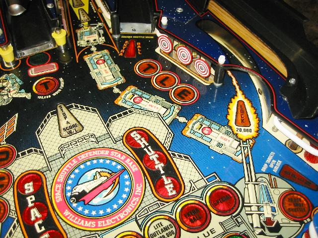
The original scan of the playfield along the left outlane. Note the gradual change from yellow to red using coarse diamond shaped dots.
Reproducing this proved more difficult than I thought, and it took several days to develop the technique.
The original scan of the playfield along the left outlane. Note the gradual change from yellow to red using coarse diamond shaped dots.
Reproducing this proved more difficult than I thought, and it took several days to develop the technique.
The redrawn playfield using the gradient dots as a back layer. This allows me to replace it later if needed.
Note that the blue is solid. The grainy texture is due to JPG compression in this excerpt.
Note that the holes in the playfield have wood texture. In the finished
overlay, they can be cut out, or left in place to cover the wood.
I chose to setup four
layers in the
main Photoshop file. The bottom layer is the calibrated
merged
photographic scan. The next layer I called 'sky' and is the
black
to blue gradient using the dot pattern. Putting it on a
separate
layer allows the background to be replaced in the future. The
next layer is the main artwork, consisting of the upper playfield and
the material on the extreme left and right. Finally, the
center
of the playfield is its own layer. Small sections were
cropped,
and then redrawn on their own. Each of these subfiles has
many
more layers, which are then merged for one paste into the main
file. These smaller files allow easier handling by the
computer,
and leads to faster and safer saves. I can also in the future
open them again if I need to shift things around, and replace them in
the main file. At the conclusion of the redraw, the main file
was
about 300MB (~62 Mega Pixels). The individual sub-files were
about 20MB each.
Test
Print
2
I ordered a full-scale test print (TP2) on the same translucent backlit material that I used for the translites. The colors were a little muted as a result of the medium, but still very vibrant. The intention of using a translucent material was to be able to most easily check the registration of the artwork. Overall, the colors were the right hue, except the background blue sky was too dark (lower part of playfield background), and the dark gray was also too dark.

Test Print 2 next to the junk playfield. The dark colors are a bit muted
because of the choice of translucent medium.

I ordered a full-scale test print (TP2) on the same translucent backlit material that I used for the translites. The colors were a little muted as a result of the medium, but still very vibrant. The intention of using a translucent material was to be able to most easily check the registration of the artwork. Overall, the colors were the right hue, except the background blue sky was too dark (lower part of playfield background), and the dark gray was also too dark.
Test Print 2 next to the junk playfield. The dark colors are a bit muted
because of the choice of translucent medium.
I made a
simple light table
by propping up the wooden playfield plank up on
soup cans, and then inserting a large fluorescent shop light underneath.
As you can see, the inserts shine brightly through, and I can
check the registration much more accurately than with Test Print 1.
soup cans, and then inserting a large fluorescent shop light underneath.
As you can see, the inserts shine brightly through, and I can
check the registration much more accurately than with Test Print 1.
With the above setup, I
could much
more accurately check the registration. The errors proved
interesting. Overall, the right hand side of the playfield
had to
be shifted up, and the left side had to be shifted down. It
was a
sort of 'racking', or parallelogram-shaped correction. The
highest error was 3 mm, but most errors were in the 1-2 mm
range.
Interestingly, there were many inserts that did not need
shifting. Possible explanations are a slight distortion of
the
original scan, or differences between Karl's playfield and
mine.
After a few days work, the artwork file was adjusted and shifted to
line up with the playfield.

April 2011 update. This test print now hangs in the window of my NASA office and functions as stained glass.
Afternoon sun lights the print up very nicely.
April 2011 update. This test print now hangs in the window of my NASA office and functions as stained glass.
Afternoon sun lights the print up very nicely.
For this test, I decided
to print on
high gloss photo paper for the best color rendering.
Test Print 3 turned out real beautiful. The colors were very vibrant and
matched quite closely. Only the blue background on the
lower playfield needed to be tweaked.
Although not really
visible in the
above image, the colors turned out very vibrant and beautiful this time
around due to the choice of printing medium. To my relief,
the
shifts to the artwork made from Test Print 2 were verified, and all the
inserts matched to well within one half millimeter. The light
and
dark grey (adjusted for this print) also matched. However, I
thought the blue background turned out too red. Suspecting
this,
included a color wheel along with the artwork for Test Print 3 so that
I could adjust and calibrate the printer. At this point, the
Photoshop file is 280 MB. The print file is 18 MB.

Application of 476MP adhesive to the back of the print to make it self-adhesive.
Application of 476MP adhesive to the back of the print to make it self-adhesive.
E-mail from a recipient of Print 3:
|
Hi Ed,
sorry for the
delay. I got the poster, many thanks. You have done
some
excellent work there.
Thanks
again Mick
|
Test
Print 4
Now that I was confident that the artwork file would line up with the playfield, it was time to take the next step, and to print onto vinyl. One problem with playfield overlays is that they have areas that are transparent, yet have color and black and white in other areas. After lots of searching and phone calls, I found a printer that was able to prepare an overlay to do that. The print proof is shown below, with the parts in pink signifying the clear (transparent) areas.
As one can see, there are certain challenging areas. For example, at the top of the playfield, the letters "U-S-A" are in white color. They float in the middle of an insert. The next example is in the center of the playfield, where there are six circular inserts with the white words "Space Shuttle" crossing ink/clear boundaries. The printer needs to be able to print white ink on clear, or use a multi-layer process, where white vinyl is first used, and then the clear areas cut out and removed. Afterwards, a protective clear layer is applied. In the case of Test Print 4, the latter process will be used.
A major step forward is printing on vinyl. The parts in pink will be clear to allow the inserts below to show.
The file with the color
artwork was
imported into Adobe Illustrator, and the lines to be cut were then
drawn in that software. The finished file can be sent to the
printer.
The advantage of using vinyl are two fold:
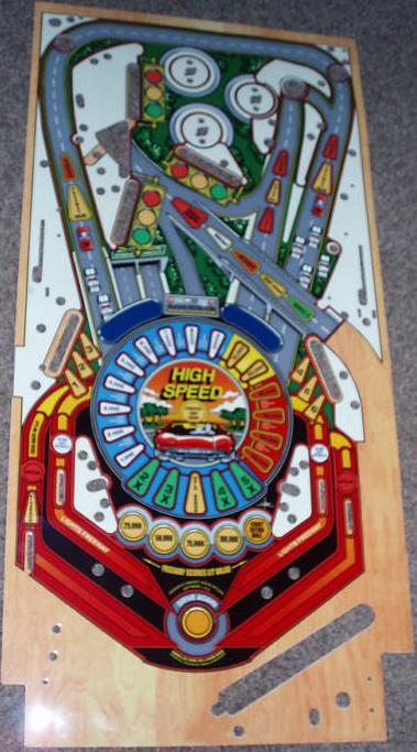
Here is another overlay for High Speed that is of inferior construction. It was on Ebay in August 2009, and sold for about $190.
The advantage of using vinyl are two fold:
- It allows the use of a liquid to 'float' the overlay while
it
is drying so that it can be precisely positioned to align with the
inserts. See a link below for such a product. If
paper were
used for the overlay, it would probably absorb this liquid, and swell
and distort.
- The clear parts would not have a 'ridge' that could affect
ball
movement. In addition, the clear areas will allow the inserts
to
be visible with their full brightness.
Here is another overlay for High Speed that is of inferior construction. It was on Ebay in August 2009, and sold for about $190.
Print 4 on adhesive vinyl with clear and color parts.
Close-up of the center of Print 4. Compare with this view of my restored playfield.
This test print had some
small
defects: 1) some lettering was on the top of the clear vinyl, which
means it would not be protected, 2) the size was 0.8% too large
(about 5/16"). This means that some inserts on the ends of
the
playfield would not line up, and 3) the blue sky background turned out
a bit purple in this printing. A subsequent test print will
address
these problems.
Test
Print V
Test Print V corrected most of the issues above. The size was perfectly aligned with the test playfield, and the insert text is applied separately. An important benefit of that is that the user no longer needs to sand the entire playfield to bare wood. If the inserts on the subject playfield are reasonable, they can be preserved, and after proper sanding to smoothen out the old paint, the overlay can be applied. The user can also apply the insert text only on the inserts that need them.
Test Print V corrected most of the issues above. The size was perfectly aligned with the test playfield, and the insert text is applied separately. An important benefit of that is that the user no longer needs to sand the entire playfield to bare wood. If the inserts on the subject playfield are reasonable, they can be preserved, and after proper sanding to smoothen out the old paint, the overlay can be applied. The user can also apply the insert text only on the inserts that need them.
Test Print V. The insert text is now separate.
Test Prints 6A and 6B
were done in
miniature to try and get the blue sky color right.
I was still not
satisfied with the
blue sky background, and ordered two
small test prints to check the color accuracy. This was not
fully
successful as can be seen in the photo above. The one on the
left
was
too dark and purple, while the one on the right was too
light.
The
printer then had the good idea of sending me a sample of blue colors on
the actual white vinyl with the RGB values written into the
samples.
This would allow me to nail the right value to use.
Color sample with the blue Pantone colors and their RGB values printed
with the same printer on the same substrate. This is much more accurate
than the color wheels I was using in the corners of the artwork.
This print is the
culmination of a
lot of effort to get things right.

Betcha can't tell which one is the real playfield 8-).
Betcha can't tell which one is the real playfield 8-).
| Edward, I got it today! I will be sure to sent pictures. My playfield is sanded, just need to get some 1000 grit for the final sanding then I will coat it and go for the install! The mylar, then re-assembly, testing and ....cabinet next summer. Thank you!! It looks great!!! Nice Job!!!! Christopher K. |
I no longer have a playfield to apply the overlay, but below are several users of the overlay that sent me their photographs.
Restoration #1 by Daniel C. The result is absolutely stunning. Click on the image for a full resolution photo.
|
Ed, I received your
overlay a
few months back…took me a while to build up the nerve to attempt the
task. As you
requested in your
custom overlay instructions, attached are a few photographs of the
finished product, minus the glass, for clarity. The overlay was
perfect. Installation was not too bad. I used a
soapy water
solution for the placement of the overlay on the empty
playfield.
One thing that sorta threw me was all the clear mylar areas had
moisture trapped behind them. But with time, approximately
one
week, that problem cleared up. I am very glad
that you
took the time in preparing your web pages with so much care.
I
took at least 100 pictures of mine game while taking the playfield
apart, but I seemed to have missed a few areas that became important
during the re-assembly of the playfield. I must have at least
100
hits on your web site. Each visit answered a question or
pointed
me in the correct direction to proceed…a thousand thanks! Again..I
want to thank you for your efforts with the overlay. I bought
the
machine
sight unseen, and was very disappointed with the playfield
condition.
With your efforts and care, the look of the game is the same as I
remember.
|
It is very gratifying to see another machine beautifully restored (Restoration #1).
Restoration #2: Here are pictures from Ken C., another person that installed the overlay.
Restoration #2: Note that Ken did a better job with the insert text.
This playfield looks really beautiful.

Restoration #3 courtesy of Andrew. Note the similarity with #1, except Andrew
repainted his bullseye targets for a very complete restoration. Click
the image above for an overall view.
|
|
Restoration #4 from Dana in Canada. Click image for full size.
#5 from Joe. He will be repainting the Shuttle and targets next.
It looks great already.
I put the overlay on and the game look so much better. I didn’t use the insert text since mine was in good shape except the space shuttle center inserts and I over sanded the stop and score insert. I sanded out the space shuttle text since your font was different than what my machine had. I left the partially missing stop and score as is. I leveled by clear coating my existing field. Almost all of the original paint is still on the board minus what was missing from the wear that necessitated the overlay in the first place. I’ve got a cleaner unbroken shuttle in the house already, but I’m testing a protector under the old broken one before I install the nicer one. I also have the new T target, just not installed yet. The bullseyes are also going to get touched up. I just got it back together and fully working this evening. If you want to throw those pics on your overlay page feel free. There was also missing paint around the top of the pop bumpers. It looks great now. Joe |
Unit #6 from Greg B.
Another photo from Greg (time lapse).
Overlay #7 from Brian B. He writes:
|
Hello
Dr. Cheung, I
slid the overlay as far up as I
could for the HEAT SHIELD hole (see pics) but it wasn't enough
for the
angled S-H-U-T-L-E letters. Skipped
the black painting around
the inserts part, the original playfield had a few
off center
mistakes so this didn't bother me. The
overlay was easy for one person
to do, used soap & water and it was so thin it didn't take much
effort
to flatten it out. It's
not perfect but I had fun doing
it, thanks for sticking with your efforts to provide an affordable
overlay
|
Overlay from Chris G.
To compare the size of your playfield with my reference unit:
- Place the zero mark at the center of the green "A" insert at the top of the playfield.
- Measure to the 'bottom' of the Heat Shield hole at the other end of the playfield.
- Mine measures 34 7/8".
Other Overlays
Spurred on by his success in installing my overlay, and the instructions on this page, Daniel C. decided to make one himself for his 6 Million Dollar Man machine. The photo below shows the installed result. It looks amazing!

Photo by Daniel C. and the overlay he made for his Six Million Dollar
Machine.
Spurred on by his success in installing my overlay, and the instructions on this page, Daniel C. decided to make one himself for his 6 Million Dollar Man machine. The photo below shows the installed result. It looks amazing!
Photo by Daniel C. and the overlay he made for his Six Million Dollar
Machine.
Page 2 of Playfield Page
- Star Base Overlay from Classic Arcades.
- Installing an overlay (Pinball Magic).
- Project with overlay printed on translucent material.
- Liquid to allow repositioning of an overlay while it is drying.
- Problems with clearcoating an overlay if there is an adhesion problem.
- EBD overlay project (L. Hammer).
- Restoration of a Silver
Skates EM playfield (a Photoshop lab).
- Applying this overlay (custom instructions).
Project Log
- February 23, 2007 - 600 dpi scans received from Karl Ruehs. The ten JPGs total 151 MB in size.
- March 12, 2007 - Finished redrawing one fourth of the playfield.
- March 23, 2007 - Finished redrawing
the
entire playfield.
- April 20, 2007 - After a few weeks off from this project to get my Pinbot working, Test Print 2 is done.
- May 25, 2007 - Test Print 3 done.
- September 5, 2007 - Test Print 4 on vinyl.
- October 13, 2007 - Test Print 5 corrects the issues with TP4.
- November 3, 2007 - Test Print 6A and 6B.
- November 17, 2007 - Print 7 is done.
- February 6, 2008 - Installed pictures.
- August 10, 2008 - Installed pictures from Ken C.
- December, 2008 - Keith N. reports that his playfield is
1/4"
longer than any of the ones I have seen before. Fortunately,
I
had a print that was erroneously printed too large that will
fit.
As a result of this, the install
instructions are updated.
- July 2009 - Another user reports the same problem as Keith above. He too has the playfield with the 'kidney' shaped inserts in the middle.
- November 2011 - Added sizing information.
- January 2012 - Switch from calendared to cast vinyl. The latter is more expensive, but is more stable in size and thinner (from 7 to 5 mil).
(c) 2007 Edward Cheung, all rights reserved.